
I Analyzed 300+ Indian IPOs. Here’s What Actually Works.
*This is a mirror to the content posted onIn India, 103 major IPOs hit the market in 2025 alone. That’s roughly two IPOs every single week. And this happened in a year when the broader markets weren’t exactly on fire. Still, we saw IPOs clock listing gains north of 65% - which is wild, by any standard.
Disclaimer: This post is purely a data-driven analysis. It’s not investment advice. IPO investing carries risk, and past patterns don’t guarantee future gains. Always do your own research and be prepared for potential losses.
For better or worse, IPO investing in India has historically been a mix of data, instinct, and straight-up luck. If you understand how the game works, subscription trends, GMP chatter, and market mood, it’s generally been a decent way to make quick, short-term returns. The playbook is familiar: apply, hope you get an allotment, and exit on listing day to book the pop.
There’s no shortage of opinions and anecdotal wisdom floating around. And if you think heuristically, it’s easy to form thumb rules about how to position yourself. But beyond that, it often comes down to luck and timing.
This post is an attempt to separate intuition from evidence and let the data do the talking.
We’ll dig into questions like:
- What actually drives listing gains, and which signals are genuinely useful when betting on IPOs?
- When does it make sense to sell on listing day, and when is holding the smarter move?
- And finally, how much of the IPO “hype” survives beyond the first trading session?
The Data
The IPO-level data used in this analysis is sourced from Chittorgarh.com, while post-listing, ticker-level price data comes from Fyers. Together, these cover both the IPO phase and what happens after the stock actually starts trading.
I have collected the data of 300+ listings in the Indian market since 2021 for this analysis.
What is GMP?
GMP (Grey Market Premium) is the unofficial price at which IPO shares trade in the grey market before listing. In simple terms, it reflects market excitement around an IPO.
A higher GMP typically indicates stronger demand and expectations of a positive listing, while a low or negative GMP suggests weak interest. It’s not regulated, not guaranteed - but it’s often treated as the pulse of IPO sentiment.
One can find the GMP of a particular stock through websites like Chittorgarh.com
What is Subscription?
Subscription data shows how many times an IPO has been applied for compared to the shares available in that category. This is broken down by investor categories:
- QIB - Qualified Institutional Buyers
- NII - Non-Institutional Investors (HNIs)
- Retail - Individual investors
- Employees - If applicable
Oversubscription indicates strong demand, but who is oversubscribing matters just as much as how much.
What Is “IPO Success”, Really?
To keep things objective, this analysis uses a straightforward definition:
Listing success = 1% + return on the listing day
Listing return = (open price - issue price) / issue price
Holding Returns
Performance of the stock after listing, tracked over periods like one week, one month, and one year.
Importantly, predicting direction is much easier than predicting magnitude.
What is Sale Type?
Sale type describes how the company is raising money through the IPO:
- Fresh Issue / Fresh Capital → Company is raising new funds to grow or repay debt.
- OFS (Offer for Sale) → Existing shareholders (promoters, early investors) are selling their shares.
- Combination (Fresh + OFS) → Both new shares are issued, and some existing shareholders are selling.
Why it matters:
Fresh issues signal the company is raising money for growth, while OFS-heavy IPOs are more about exiting investors. This can influence demand, pricing, and post-listing performance.
Correlation
To study how IPO signals relate to listing day returns, two types of correlation are used.
Pearson correlation checks whether two values move together in a straight line. If higher GMP consistently leads to proportionally higher listing gains, Pearson picks that up.
Spearman correlation is more forgiving and more realistic. It only looks at ranking - whether IPOs with higher GMP generally perform better than those with lower GMP.
Why this matters:
A GMP of 40% doesn’t guarantee twice the gains of a GMP at 20%. But IPOs with 40% GMP still tend to outperform IPOs at 20%. Pearson struggles with this nuance; Spearman captures it well.
How to Read Correlation Numbers
Both Pearson r and Spearman ρ range from –1 to +1.
+1 → strong positive relationship
0 → no real relationship
–1 → strong negative relationship


As a rule of thumb:
0.2–0.4 → weak
0.4–0.6 → moderate
0.6–0.8 → strong
0.8+ → very strong
Using both helps distinguish between exact prediction and directional edge, which is far more useful in messy, real-world markets.
Below is the correlation of
| Signal | Pearson r | Spearman ρ | What it Tells Us |
|---|---|---|---|
| GMP (%) | 0.82 | 0.76 | Strongest predictor by a wide margin |
| Total Subscription | 0.70 | 0.72 | Demand matters, but less than GMP |
| QIB Subscription | 0.67 | 0.73 | Institutional interest is a key signal |
| NII Subscription | 0.58 | 0.62 | HNI demand has moderate impact |
| Retail Subscription | 0.46 | 0.56 | Weakest, but not irrelevant |
Clearly, GMP has the best correlation.
To demonstrate this better, below is a plot of GMP, total subscription and listing gains. Note that the x and y axes are log scales (for clarity) and the listing gains are represented by colour (this is rounded to 0.5% to 20% for the sake of clarity)
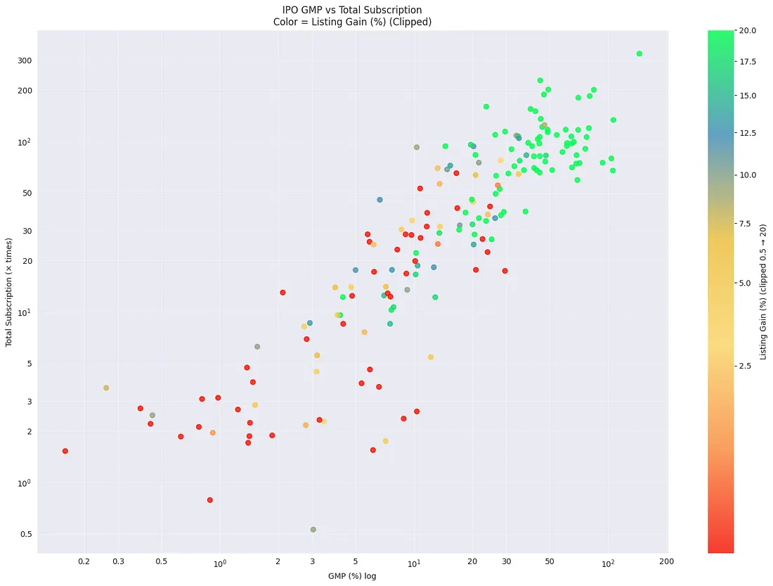
Clearly, there’s a good chance of listing gains if GMP is 20% or more and/or subscription is 25x or more.
The following section gives a closer look at the same stats.
Listing gains by GMP
Below is the bucketized GMP and listing gains stats. A successful listing is when the listing of an IPO gives more than 1% returns.
gmp_bucket |
count |
success_rate |
median_return |
|---|---|---|---|
| <0 | 40 | 0.38 | 0.00 |
| 0–10 | 99 | 0.49 | 0.00 |
| 10-15 | 29 | 0.62 | 0.04 |
| 15–20 | 20 | 0.85 | 0.14 |
| 20–25 | 21 | 0.81 | 0.19 |
| 25–30 | 22 | 0.82 | 0.23 |
| 30–60 | 57 | 0.98 | 0.37 |
| 60+ | 34 | 1.00 | 0.74 |
Clearly, there’s a good chance of listing gains for cases when GMP is more than 15%
Listing Gains by total subscription
total_sub_bucket |
count |
success_rate |
median_return |
|---|---|---|---|
| <1x | 5 | 0.20 | -0.01 |
| 1–10x | 100 | 0.43 | 0.00 |
| 10–20x | 32 | 0.62 | 0.08 |
| 20–30x | 24 | 0.50 | 0.01 |
| 30-50x | 32 | 0.81 | 0.12 |
| 50x+ | 129 | 0.95 | 0.36 |
Here, above 30x total subscription, we stand a decent chance of making good returns
Listing Gains by sale type
sale_type |
count |
success_rate |
median_return |
|---|---|---|---|
| Fresh Capital | 57 | 0.74 | 0.12 |
| Fresh Capital & OFS | 204 | 0.69 | 0.10 |
| Offer For Sale | 61 | 0.69 | 0.08 |
There’s a slight statistical bias towards fresh capital, which is kinda intuitive. Money going to the company can later be used to pay off debt or for Capex and expansion, etc which is better for the new shareholders
Post listing 1st day return
sale_type |
mean |
median |
count |
|---|---|---|---|
| Fresh Capital | 3.77 | 5.00 | 57 |
| Fresh Capital & OFS | 0.16 | -0.14 | 204 |
| Offer For Sale | -0.11 | -0.54 | 61 |
Here again, there’s a good bias to fresh capital, meaning it may be worth holding IPOs with fresh capital.
Post listing
The goal of the following table was to understand, statistically, if there is a correlation between listing gains and returns in the 1st week, month and year of listing
listing_gain_bucket |
next_week_return mean |
next_week_return median |
next_week_return count |
next_month_return mean |
next_month_return median |
next_month_return count |
next_year_return mean |
next_year_return median |
next_year_return count |
|---|---|---|---|---|---|---|---|---|---|
| Loss | 1.60 | -0.26 | 91 | 2.02 | -1.44 | 87 | 8.71 | -4.42 | 58 |
| 0–5% | 0.79 | -1.70 | 42 | 3.83 | -1.64 | 42 | 20.25 | 1.54 | 27 |
| 5–10% | 0.92 | -2.03 | 30 | 1.11 | -1.51 | 29 | 6.81 | -2.01 | 21 |
| 10–20% | 3.95 | 1.69 | 49 | 4.27 | -1.06 | 48 | 27.87 | -0.52 | 31 |
| 20–50% | 0.41 | -2.90 | 65 | -0.16 | -3.23 | 62 | 20.51 | 3.01 | 48 |
| 50%+ | -0.07 | -2.14 | 45 | -2.52 | -5.28 | 45 | 11.23 | -15.36 | 41 |
But clearly, it’s not a good signal. The hold/ buy call based on just listing gains doesn’t make sense.
Average subscription
The data below shows the average ratio between retail and sNII subscriptions. This is a fairly consistent trend: retail investors usually have better chances of getting an allocation based on subscription numbers. However, in terms of absolute returns, investing around Rs2 lakh in the sNII category often offers more upside. On average, the multiple tends to be around 2.5x.
gmp_bucket |
sub_sNII (bids below Rs10L) |
sub_Retail |
sNII_to_Retail_ratio |
|---|---|---|---|
| <0 | 1.97 | 3.17 | 0.62 |
| 0–5 | 4.54 | 3.13 | 1.45 |
| 5–10 | 29.21 | 9.63 | 3.03 |
| 10–20 | 55.03 | 21.89 | 2.51 |
| 20–50 | 106.96 | 36.40 | 2.94 |
| 50+ | 150.36 | 59.76 | 2.52 |
Conclusion: Data Over Hype
The numbers reveal a clear pattern: IPO success in India isn’t just a roll of the dice; it’s a signal-driven game. To navigate this market effectively, keep these three data-backed rules in mind:
- Trust the GMP: With a 0.76 correlation, the Grey Market Premium is your most reliable North Star. A GMP above 20% is the historical sweet spot for high-probability listing gains.
- The 30x Threshold: Subscription matters, but only at scale. Once total demand crosses 30x, the likelihood of a successful listing (1%+ gain) becomes significantly more stable.
- Quality of Capital: IPOs focused on Fresh Capital consistently outperform OFS-heavy exits. If the money stays in the company, the market usually rewards it.
The Final Word: A massive listing “pop” does not guarantee long-term growth. The data shows no strong link between Day 1 gains and Year 1 returns. For the short-term trader, follow the signals; for the long-term investor, look beyond the first day’s excitement.
If you have ideas for other comparisons or signals to analyse, I’d love to hear them! Drop your suggestions in the comments, and let’s dig deeper together.
read more...